Thursday, 31 March 2011

What is Graphic Design for?

During Thursday's debriefing for the Easter Break we were tasked with quickly writing down criteria within given sections that would help us to focus on what type of briefs would allow us to produce the kind of work we want.  Moving forward into the latter stages of this year and into the final year, I now need to become more specific on exactly the type of graphic designer I want to become, although I feel I have already began to make progress with this so far through the second year. 


To work on clear, focused briefs on subjects I am passionate about will allow me to build a portfolio that should really show who I am and what Im interested in as a designer. Now after having a little time to look back on this sheet I will draw up another that is more detailed and considered as these decisions I make now will form the path I take through the rest of the course.

Wednesday, 30 March 2011

Web Design Session 1

 Identify Workspace > You need a brief.
- Space to show work
- Contact details
- Promote yourself

*You have less than 5 seconds to impress.
Layout/Colour/Font are imperative in delivering the first impression.

+
Statement page
Large image background
Illustration overlaid
Clear navigation/use-ability
Intriguing
-
Too many boxes
Too much like a template
Poor navigation
Repeat patterns or gradients

Anything to do with a website goes into a root folder.
The internet is just the accessing of other peoples files on their computer.
Keep file names to 8 characters or less.

Web standards:
- Always design for the lowest common denominator.
- Size - 800 x 600 pixels, vertical scroll bars are okay, horizontal ones are not.
- Fonts - HTML fonts, selected font families, give people several choices for fonts.
Eg. Verdana, Geneva, - Sans-Serif.
- Images aren't immediately searchable.
- Quality is an issue and it increases the file size.
- Design in RGB colour mode.
- Check the box 'Only Web Colours'.
- Websites should be under 5MB when finished.
- When you buy webspace, you buy band width.
- In Photoshop, look for;
 File > Save for web devices, then select JPEG and choose image quality.
- Maximum of 8 pages on the website.
Eg. Home/Contact/About/News/Work/Client List.
- Some can be joined together ; Home & About?
                                                                        

Welcome to the world of Dreamweaver ... so this is what it looks like...


Website Mapping

Initial site mapping diagrams looking into functionality and use-ability... the first one seems to have a corner missing. Hmm...


Tuesday, 29 March 2011

Saturday, 26 March 2011

Friday, 25 March 2011

ycn - Submission

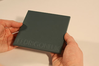
The Fedrigoni brief is all wrapped up and complete. The proof and the presentation boards me and Sarah sent are below:


Thursday, 24 March 2011

ycn - Resolved Webpage Screenshots

I tried a few different colours and fonts for the digital type that has been added but I have eventually opted for Orator in white. Orator was used as a guide for the paper cut outs on the tabs so it makes sense to keep it consistent with that. The white also shows up really well against the images.
Ideally I wouldn't want the type to be placed on flat like this. In my mind I would want the paper shapes to move around once they had been clicked on, similar to a kind of mobile but that would involve building the website in Flash I presume which I don't know how to do...


ycn - Webpage Development

The images have now been cleaned up in Photoshop and placed inside web browser windows. Text just needs to be added digitally now to finish them off.


ycn - Images for Webpages

These are the four photos I have chosen to use to mock up the final webpages for Fedrigoni. I just need to erase the creases and paper edges and then add on type digitally.


Wednesday, 23 March 2011

ycn - Final direct mail with type mock up

Sarah has added the address to the front and the information on the inside digitally and it actually looks a lot better than I thought it would. It'll definitely work for the purpose of being laid out on a presentation board and helps the piece look more convincing and authentic.


ycn - Final Direct Mail

Final images of the direct mail-out also taken with the Tungsten lighting and SLR camera. These images also just need final bits of text adding digitally before they can then be laid out onto the presentation boards.


ycn - Photographing of the Webpage

Photographs taken with Tungsten lighting and SLR camera. 

The results look really good and both me and Sarah are happy with the final images we have. The next step involves me 'cleaning up the images' in Photoshop by removing creases and paper edges and then adding on text digitally to turn the photos into something that resembles a more conventional webpage.