I have found the Image module to be a highly enjoyable and beneficial period during my second year of study. Since the start I have really enjoyed the fast paced nature of work and the overall format of the briefs and lessons set for us. Even though there was often a quick (1 week) turn around on many of the set briefs, I really aimed to produce something that was carefully considered and of high quality as I realised that this was a great opportunity to make pieces that could really boost my portfolio.
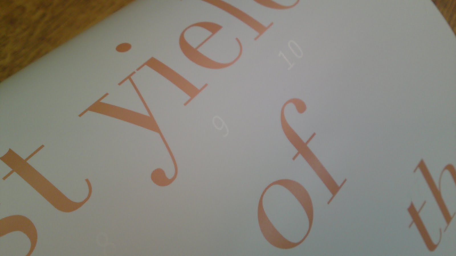
The module has enabled me to investigate a wide variation of working practices, ranging from getting back to basics through hand drawing, refreshing my screen printing knowledge and also designing for resolutions I had not yet experienced. I found the briefs that were set often had a good balance between being open to our own interpretation whilst also having to keep in mind specifications of the required resolution for example. The first project that stands out for me was 'Type As Image'. I really enjoyed this brief as we were required to produce three large scale posters and I managed to use a different method of design practice to create each one; hand cut paper, digital print and screen print. Another highlight was 'Scale/Frame/Format' where we were given a certain object to work with and a very fixed resolution to work towards. This turned out to be much more interesting than I first anticipated since my given object of a skateboard I initially found to be less than inspiring. But, after developing a good, old-fashioned hand rendered design, I ended up with something that I was very pleased with and received very positive feedback on from other people in the group. Perhaps the most successful and fully resolved work from the module was my piece for the 'Book Works' brief where we designed an edition of 10 publications that were to be sold at a public book fair. This was a opportunity for me to get stuck into some editorial and layout work - which I had been longing to for some time - and luckily my idea came quickly and the development and production went smoothly. I was really quite proud of the finished result and I got some great feedback from peers and tutors on it and furthermore, I was especially pleased to see that it sold well at the book fair.
Looking across the breadth of work produced for the Image module, I feel I have identified certain strengths within my work. I think I am a really versatile and adaptable designer as I feel I have coped well with the wide variety of tasks we have been set. I have also learnt a lot - and refreshed - many image making processes which has been highly enjoyable. Developing on from this, I have discovered much more about combining image with type whilst also looking at how type can become image in itself. Personally, I feel that the Image module doesn't really finish here, the short nature and quick responses to the briefs mean they are almost starting points for further investigation which I can carry over into other projects in the future. I am confident that I can carry with me the things I have picked up through this period of work as it has been a relatively short but very enjoyable time that has hugely benefitted my design practice and also the way in which I approach a project.
The module has enabled me to investigate a wide variation of working practices, ranging from getting back to basics through hand drawing, refreshing my screen printing knowledge and also designing for resolutions I had not yet experienced. I found the briefs that were set often had a good balance between being open to our own interpretation whilst also having to keep in mind specifications of the required resolution for example. The first project that stands out for me was 'Type As Image'. I really enjoyed this brief as we were required to produce three large scale posters and I managed to use a different method of design practice to create each one; hand cut paper, digital print and screen print. Another highlight was 'Scale/Frame/Format' where we were given a certain object to work with and a very fixed resolution to work towards. This turned out to be much more interesting than I first anticipated since my given object of a skateboard I initially found to be less than inspiring. But, after developing a good, old-fashioned hand rendered design, I ended up with something that I was very pleased with and received very positive feedback on from other people in the group. Perhaps the most successful and fully resolved work from the module was my piece for the 'Book Works' brief where we designed an edition of 10 publications that were to be sold at a public book fair. This was a opportunity for me to get stuck into some editorial and layout work - which I had been longing to for some time - and luckily my idea came quickly and the development and production went smoothly. I was really quite proud of the finished result and I got some great feedback from peers and tutors on it and furthermore, I was especially pleased to see that it sold well at the book fair.
Looking across the breadth of work produced for the Image module, I feel I have identified certain strengths within my work. I think I am a really versatile and adaptable designer as I feel I have coped well with the wide variety of tasks we have been set. I have also learnt a lot - and refreshed - many image making processes which has been highly enjoyable. Developing on from this, I have discovered much more about combining image with type whilst also looking at how type can become image in itself. Personally, I feel that the Image module doesn't really finish here, the short nature and quick responses to the briefs mean they are almost starting points for further investigation which I can carry over into other projects in the future. I am confident that I can carry with me the things I have picked up through this period of work as it has been a relatively short but very enjoyable time that has hugely benefitted my design practice and also the way in which I approach a project.