Friday 20 November 2009

Brief: No News Is Good News: Message and Delivery


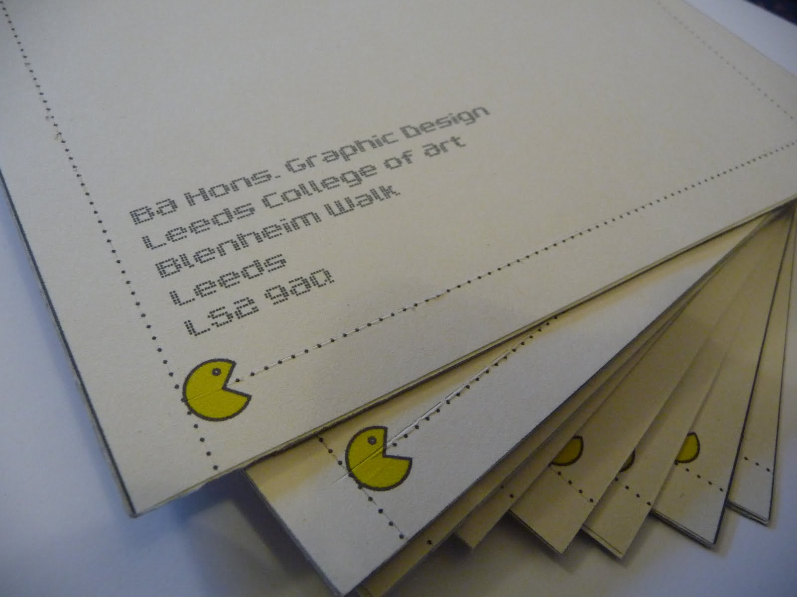
Upon designing the mailshot I felt that it needed to be interesting to open whilst retaining its pleasing visual simplicity. I then came up with the idea of using perforated edges on the envelope which I thought would make the recipient more intrigued to open it but more importantly i felt it was a good way of including a subtle message about wasteage. The action of tearing paper and throwing it away links directly to the subject of the mail and posters which is all about human consumption.
Once opened the mail would be lined with the pac man designs used in my posters and hold inside some informative postcards with various statements and accompanying visual imagery. In terms of the mailing list, the piece was to be sent to companies that deal with large volumes of food such as the major UK supermarkets as well as our own forest protection agencies and environmental charities.
The overall design was kept consistent with that of the posters whilst adding extra little details to develop the piece further.
Im really pleased in particular with the envelope as the deign is clean and contemporary whilst being intriguing to open.

Visual Language: Colour Theory 3


Tuesday 10 November 2009

Visual Language: Colour Theory 2


Brief: No News Is Good News: Message and Interpretation


For the 'no news is good news' brief we were asked to create a series of 3 high impact posters based around a newspaper headline we had chosen. One poster was to be purely text, another purely image and the other both text and image. My headline was about human consumption (particularly food production) and its effects on the planets resources. We were encouraged to use simple shapes and symbols in order to communicate our message quickly and effectively and i have used a 'pac man' theme to show the destruction of rainforests. Each poster had to measure 21cm by 42cm and other constraints included a maximum of two colours plus stock.

Friday 6 November 2009

Visual Language: Colour Theory

Organisation of objects going from light to fluorescent to dark.

Matching the colour of the object to its equivalent in the Pantone swatches.

Sunday 1 November 2009

Visual Languge: Illusion letterform


This was our groups attempt at creating a visual illusion of a letterform that is spread over multiple plains. We chose to create a letter H and the result is pictured above. Each of the plains were constructed out of different shaped boxes with black card used to define the letterform.