Monday 28 February 2011

ycn Collaboration

For the up and coming project we are set to work with a creative partner one of 17 live briefs available through the young creative network (ycn) website. We were asked to read up on the potential projects and narrow them down to three that we would like to attempt - and one that we definitely didn't.

The three that have caught my eye so far are;

Fedrigoni -

Background

It’s nearly as old as communication itself, yet today, paper is as versatile and technologically advanced as any silicon chip. Fedrigoni has been refining the art and science of making fine-quality special papers for more than 120 years. Striking surfaces, tactile textures, vivid colours, paper that can be pressed, bent, cut and folded into almost any form you can imagine.
Our papers are ultra functional and at the same time, wonderfully expressive. They can shock and surprise, or soothe and reassure. They can demand your attention or retire gracefully into the background.
In our hands, paper is no ordinary communication tool; it’s an art form in its own right.

---------------------------------------------------------------------------------------------

- This brief has attracted me since the last module was mainly software and digitally based and so I think I would enjoy getting back to basics and crafting paper. I also feel there is plenty of freedom within this project and its not too heavily constrained by the existing branding of the company.

---------------------------------------------------------------------------------------------


Green & Black’s -

Background

“When Green & Black’s was launched in 1991, we cheekily declared it to be ‘guilt-free’ chocolate. As the world’s first organic chocolate, it gave passionate chocolate lovers a way to indulge their taste buds without having an environmental impact…because conventionally grown cacao is still one of the most heavily sprayed food crops in the world. But we know that what makes someone buy a Green & Black’s treat a second time…and a hundredth time…is sheer deliciousness.”
–Jo Fairley, Founder of Green & Black’s
Many are unaware of the origins of the name Green & Black’s; quite simply it’s a name made up by Craig and Jo, our founders. Green is for the Organic principles that we have always stood for and Black for the rich, deep colour of the chocolate and its intense taste. The ability to fuse these two elements together is what makes us so unique.

---------------------------------------------------------------------------------------------

- Green & Black's is a chance to be part of a bold and engaging campaign that is exciting and fun as we are asked to 'create a buzz' around the brand. It sounds to me like a brief that gives a good balance between having enough creative freedom and tying it into a professional branding and marketing exercise.

---------------------------------------------------------------------------------------------


Ted Baker - 

Background

At Ted, we don’t just make clothes; we make modern classics that stay by your side for years to come. We also work with licensed partners to create watches, eyewear (ophthalmic and sunglasses), footwear and fragrances to offer exclusive extensions to Ted’s core clothing business. Branded ‘Ted Baker London’, they support the brand and help push the boundaries in terms of styling, attention-to-detail and quality.
All these contemporary products are designed to appeal to the brand’s core consumers: urban, stylish, independent, career-oriented people who appreciate something different. Minimum fuss, maximum impact – whether going to a pub, the theatre or shopping.
So, while anyone can make sunglasses, for example, we need something distinctly more interesting – something that only Ted could create. The brief, therefore, is to create an integrated campaign that articulates the Ted brand in one of these four categories: watches, eyewear, footwear and fragrances (see appendix).

---------------------------------------------------------------------------------------------

- The Ted Baker brief presents an opportunity to work on a bold/daring project incorporating humour and personality into a well known high end brand. It's also a chance to work across multiple media platforms for a retail company which is something I'm interested in.

---------------------------------------------------------------------------------------------

'Describe yourself in 20 words'

In preparation for the upcoming collaborative brief and ppd sessions we have been asked to squeeze who we are as a designer/person into a short statement...hmm...

here's my attempt.... but i'll probably change it ...

... several times..

"Im a considerate and resourceful designer that loves to be informed and has a craze for quality printed media"

done it with one word to spare!

Sunday 27 February 2011

Book Works - Final Design

Once I got going with the digital development of the newspaper, I almost got carried away and the whole thing seemed to come together without me documenting a lot of the development (which is annoying!). However, I'm really pleased with what I have created and I've really enjoyed getting stuck into some proper editorial and layout design work. I just hope now that it looks good once printed, folded and finished. The choice of stock is crucial and I always knew from the start of the brief that I wanted it to be a newspaper but I'm already planning to use a bulky newsprint stock so that it holds the ink well and gives a better quality impression.

Cover
Inside Cover

Introduction


Middle double page spread

Saturday 26 February 2011

Book Works - Image Sourcing

All of the Futura book that I produce, I am planning to keep just blue and grey - apart from one double page spread near the back of the newspaper. After giving people information about the typeface as well as quotes and design work etc, I thought it would be good to show people some of the classic examples of Futura in use which would help people recognise it and understand it if they didn't already know much about the typeface itself.


All of the above images were just sourced off the internet. They certainly won't be the main focus of the newspaper, but the images and colour will provide a nice lift to the piece towards the end of the book.

Friday 25 February 2011

Book Works - Development


Book Works - Development

Digitisation of the hand drawn designs is shown below along with a pattern developed for the inside cover of the newspaper. The pattern is based on the shapes that the Futura newspaper itself is based on and maintains the current clean and simple style with minimal colours. I'm also pleased with the alphabet/Futura combination that I've designed for the outer cover - the name being picked out in a deeper blue and italics helps make the title more obvious.


Thursday 24 February 2011

Book Works - Development

I'm going to keep the name of the newspaper simple and use Futura - the name of the typeface which is the publication's subject. (Below) I have managed to develop a design that incorporates the letters of the alphabet and the name of the typeface which I think works quite well. Next I'm going to start developing the outer cover digitally as this will help move the design work on quickly so I can try a few different things and see what works best.


Wednesday 23 February 2011

Book Works - Ideas

Initial exploration into the content/layout and pagination of my Futura newspaper. I've just started looking at what things would work well together, how the layout would flow throughout and what sort of content would appeal to a people with varying knowledge of typography.


Tuesday 22 February 2011

Book Works

The Brief:

You are required to create an edition of ten "books" visually/contextually based upon one of the following:

A Colour
A Typeface
A Sound
A Shape

Consider what the visual essence of you subject matter. What are you trying to communicate and how will you do this most effectively? The books will be sold at the 14th International Contemporary Artists Book Fair.

My subject matter:
Futura Typeface

Considerations:
Format/ Scale/ Content
Typeface - Futura?
Newspaper - digitally printed or screen printed?

Target Audience:
Adults interested in typography and the printed word.
Informative tone of voice, although not too heavy.
Type as Image.

Background:
Limited colour use? One colour, one typeface?
Type as image.
Digitally printed.
What stock? Newsprint?
Newspaper dimensions?

Wednesday 16 February 2011

OUGD202 Evaluation

The OUGD202 module brought with it many new exciting and enjoyable experiences as well as a valuable learning curve in terms of my knowledge of software and project management.
The first few steps into the world of After Effects through the Silent Movie brief was the first time I had dealt with moving image and I was eager but also a little daunted when faced with getting to grips with it. During the first few weeks of After Effects workshops it took quite a while for me to understand things like key framing and co-ordinating even simple movements. Over the course of the Silent Movie brief however, when given tight restrictions on the length of composition, content, colour and theme etc of the videos, it enabled me to purely focus on the software itself and specific technical aspects which really helped me to start and understand it. I was pleased with my resolutions to the Silent Movie brief and got positive feedback but as soon as that project came to a close, I was eager to get started on the next thing and see how far I could push my developing knowledge of the software.
When beginning the Top 10 brief my initial thought was to produce a title sequence and idents of top cities to visit. But I had covered a similar theme in an earlier project and so decided to focus on Tokyo, which was the first city I had begun illustrating in accordance with the initial theme. Quite quickly I had style developing which then became a firm vision that I could see clearly working in the proposed animation. Having had to learn the software from scratch and then apply my existing design skills to it I think has proved successful and by having detailed storyboards and hand rendered, and then digitised assets in place, it meant that I didn't have to design anything within the After Effects programme and I could get on and play around with the assets at my disposal which helped greatly. Furthermore, the Top 10 brief helped me to work on my time management and organisation through developing a structured process in the way in which I work, also, due to the regular nature of crits and a consistent flow of feedback, I seemed to become more able to take on board any suggestions and found myself acting upon what I was told promptly. When looking back over the course of producing my title sequence and subsequent idents I now find it surprising to see how far I have come in such a short space of time. If someone told me to produce what turned out to be my finished piece back in December, I would of seriously doubted that I could have achieved it. Thus, Im very satisfied with the final resolutions to the Top 10 brief as they turned out very closely to what I had in mind when first sketching out my storyboards.

Attendance : 5
Punctuality : 5
Motivation : 4
Commitment : 5
Quantity of work produced : 4
Quality of work produced : 4
Contribution to the group : 4

Tuesday 15 February 2011

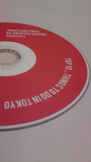
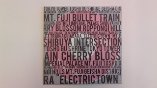
Top 10... Resolved Disc and Packaging


Im really pleased and actually quite proud of the finished look of the packaging now its all together complete with disc. I believe it has a very professional appearance and the packaging design clearly and appropriately reflects the content of the DVD. Looking at the resolved work, I believe I have produced a very competent all-round piece for the Top 10 brief.