
Sunday 30 January 2011
Top 10... Beginning of Title Sequence 2
Title Sequence 2 from Jonathan Finch on Vimeo.
I haven't yet altered the entrance of the type to the video but I have added 45 individual petals onto the tree branches which all have an opacity change on them so that they appear from left to right, following the appearance of the branches. I think once these start to move it should prove quite effective!
Saturday 29 January 2011
Top 10... Beginning of Title Sequence
Title Sequence 1 from Jonathan Finch on Vimeo.
First stage of the title sequence!!
The way in which the type comes in will be altered, but I wanted at first to concentrate on the difficult and technical bit of masking which turned the type into the cherry blossom tree branches and Im really pleased with the effect. It was created by overlaying masks on top of a separate layer of pre drawn branches and then setting the masks to reveal the original image.
Top 10... Type Considerations


The Bebas font is bold and yet still fairly slim and elegant and was essentially just what I was looking for. I also altered the curve of the descender on the letter y so it tessellated nicely with the stroke of the number one beneath it. It's all in the detail!
Type as Image - Resolutions


I received some really good feedback regarding these type as image posters - particularly the 'Just incase you're keeping score' ones. I ended up screen-printing this design in two different variations - black and varnish on white and just varnish on black. In terms of the others designs, the coloured letter one seems to look better physically whilst the 'virtually none' one looks better on screen.
Friday 28 January 2011
Top 10... Storyboarding


I've completed a 24 step storyboard to outline my plan for my main title sequence although Im aware that I don't yet have any kind of indicators to tell me how long parts of the sequence will last. Depending on how much time it would take to transfer from one scene to the next for example will obviously impact upon what amount can be included within the time frame and so adjustments may need to be made once the animation has begun.
I've also coloured the title sequence storyboards in so that it gives me a vague colour scheme to follow and work towards instead of trying to make decisions as I go.
Top 10... Development/Creating Assets

I aim to get all my assets drawn out and a firm set of storyboards in place before beginning any of my actual animation work. Above I have started to illustrate Mt.Fuji and Tokyo Tower from my Top 10 things to do as well as produce some hand rendered typography.


I decided to draw out some type by hand as Im already enjoying illustrating the other assets for the title sequence. Furthermore, particularly for the word 'Tokyo' - I wanted it to be in an oriental font style but not something that was too obvious or cliché and Im really pleased with the way it has developed.
Editorial Image - Alternative Resolution


For some reason I initially wasn't happy with these photographs I took, but now I've come to study them again, I wish I'd printed one of them out as one of my final three posters!
Wednesday 26 January 2011
Top 10... Research Facts
Taken from Metropolitan World Atlas by Arjen Van Susteren
Tokyo -Yokohama :
Total Metropolitan Inhabitants - 33,190,000
Inhabitants in Metropolitan Core - 8,130,000
Metropolitan Core Share - 24.5%
Inhabitants in Metropolitan Periphery - 25,060,000
Periphery Share - 75.5%
Employment - 7,975,000
Unemployment Rate - 4.2%
Average Income Per Capita (€) - 30,129
Gross Regional Product Per Capita - 35,052
Hospital Beds Per 1000 Residents - 12
Average Life Expectancy At Birth - 77
Crimes Per 100,000 Inhabitants - 2,240
Built-up Area (km sq) - 5,258
Population Density (Inhabitants/km sq) - 6,312
Residential Area (km sq) - 2,819
Residential Density (Inhabitants/km sq) - 9,022
Public Transport Market Share - 49%
Private Vehicle Market Share - 51%
Average Commuting Time (Minutes) - 56
Average Road Speed (km/hour) - 24.5
Vehicle Density (Vehicle km/km sq) - 73,795
Railway Passenger Density (Passenger km/km) - 143,292
Rail Vehicle Density (Vehicle km/km sq) - 1,021,163
Average January Temperature (ºC) - 1.7
Average July Temperature (ºC) - 27.8
Pollution/CO2 (Tonnes/km sq) - 45.9
Total Pollution (Tonnes/km sq) - 216.2
Sunday 23 January 2011


Type as Image - Development


Letters printed out in large scale Georgia Italic and then traced around onto the coloured paper. The colour are meant to indicate youth to mark a contrast against the statement of 'As we get older'.
Type as Image - Development
The idea for this poster came almost instantaneously. It's simply illustrating the quote through the layout of the text on the page. I think the chunky 'Rockwell' typeface is currently looking the most suitable in which to advertise the quote. I'd really like to screen print this design if I have the time during the week.


Geneva

Verdana

Univers
Type as Image
Brief :
Select three quotes carefully from the given articles (each quote must come from a different article) and visually communicate them using only the text in which they are written. No additional images are permitted.
My 3 quotes :
- Just in case you're keeping score
- Check their emotional status or Virtually none
- As we get older

Saturday 22 January 2011


Friday 21 January 2011
Editorial Image - Final Resolutions/Feedback


- Strong range of imagery using multiple media such as hand drawn, photography, type etc.
- A thin black stroke is needed to define the area around the illustrative images as the background is too similar to the newsprint stock.
- Really good use of colour on the hand rendered illustrations. Has a nice line quality and flat colour fills.
- The type image - 'happily ever after?' is a little too overpowering and distracts from the title of that particular article.
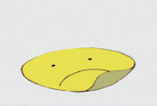
- Good use of space in the Tim Dowling article - and I've managed to incorporate two themes from the text through the swear jar and sad face sticker.
Thursday 20 January 2011
Editorial Image - Development
For two of the articles, the supporting images I have produced are hand-rendered illustrations. The 'Doctor-Doctor' article was based around personal questions sent in from readers and I thought that something drawn by hand would reflect this aspect. Below is the original sketch I did of; a glass of water, a box of tissues and some paracetemols - this was meant to link directly to one of the questions asked by a reader about the common cold.


The other drawing was of a swear jar which featured in the Tim Dowling article and I thought that this was one of the strongest parts of his column that provided a strong enough visual aspect. I also did a smaller drawing to compliment the swear jar of one of the sad face stickers that the journalist talked about which helped to fill the space of the awkward given shape.


The fineliner sketches were scanned in and then filled with colour on Photoshop to leave a clean and simple illustration with delicate lines and pleasing flat colour areas.
Subscribe to:
Posts (Atom)