The OUGD202 module brought with it many new exciting and enjoyable experiences as well as a valuable learning curve in terms of my knowledge of software and project management.
The first few steps into the world of After Effects through the Silent Movie brief was the first time I had dealt with moving image and I was eager but also a little daunted when faced with getting to grips with it. During the first few weeks of After Effects workshops it took quite a while for me to understand things like key framing and co-ordinating even simple movements. Over the course of the Silent Movie brief however, when given tight restrictions on the length of composition, content, colour and theme etc of the videos, it enabled me to purely focus on the software itself and specific technical aspects which really helped me to start and understand it. I was pleased with my resolutions to the Silent Movie brief and got positive feedback but as soon as that project came to a close, I was eager to get started on the next thing and see how far I could push my developing knowledge of the software.
When beginning the Top 10 brief my initial thought was to produce a title sequence and idents of top cities to visit. But I had covered a similar theme in an earlier project and so decided to focus on Tokyo, which was the first city I had begun illustrating in accordance with the initial theme. Quite quickly I had style developing which then became a firm vision that I could see clearly working in the proposed animation. Having had to learn the software from scratch and then apply my existing design skills to it I think has proved successful and by having detailed storyboards and hand rendered, and then digitised assets in place, it meant that I didn't have to design anything within the After Effects programme and I could get on and play around with the assets at my disposal which helped greatly. Furthermore, the Top 10 brief helped me to work on my time management and organisation through developing a structured process in the way in which I work, also, due to the regular nature of crits and a consistent flow of feedback, I seemed to become more able to take on board any suggestions and found myself acting upon what I was told promptly. When looking back over the course of producing my title sequence and subsequent idents I now find it surprising to see how far I have come in such a short space of time. If someone told me to produce what turned out to be my finished piece back in December, I would of seriously doubted that I could have achieved it. Thus, Im very satisfied with the final resolutions to the Top 10 brief as they turned out very closely to what I had in mind when first sketching out my storyboards.
Attendance : 5
Punctuality : 5
Motivation : 4
Commitment : 5
Quantity of work produced : 4
Quality of work produced : 4
Contribution to the group : 4

Showing posts with label Top 10.... Show all posts
Showing posts with label Top 10.... Show all posts
Wednesday, 16 February 2011

Tuesday, 15 February 2011
Top 10... Resolved Disc and Packaging


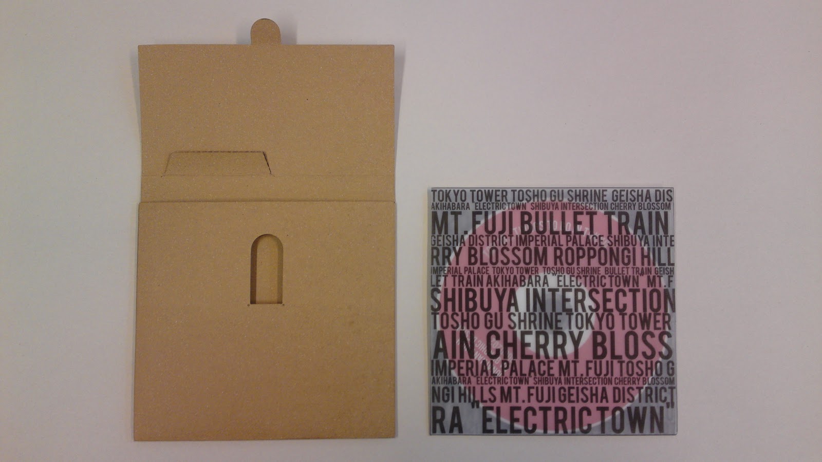


Im really pleased and actually quite proud of the finished look of the packaging now its all together complete with disc. I believe it has a very professional appearance and the packaging design clearly and appropriately reflects the content of the DVD. Looking at the resolved work, I believe I have produced a very competent all-round piece for the Top 10 brief.
Saturday, 12 February 2011
Top 10... Packaging


The inner sleeve was printed on tracing paper to allow the disc, that is yet to be printed, to show through. Im really pleased with how this has turned out as I think it helps to personalise the card disc holder more whilst the design retains a simple but effective colour scheme and the red circle on the front should give and instant indication to someone that the content of the DVD is about Japan and Tokyo.


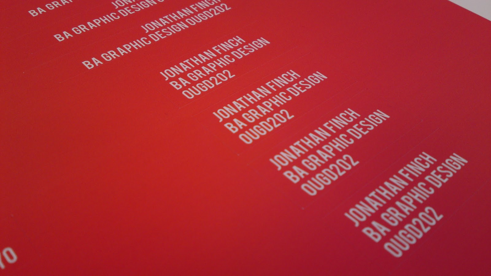


Red and white stickers printed and applied to the brown card DVD case. Colours match those used in the actual animation and I think they produce a very effective but simple design.
Friday, 11 February 2011
Top 10... Ident 4
The final ident features the end part of the main title sequence with the text and logo fading in co-ordinated with the signal pulses from the Tokyo Tower.


Top 10... Ident 3
The third ident features Mt. Fuji and the bullet train which brings in text in a different way to the other idents which help to make the short sequences a little more diverse.


Top 10... Ident 2
The second ident uses the rising sun section of the title sequence and the audio had to be faded in and out as in was cut from the middle section of the animation.


Subscribe to:
Posts (Atom)