Showing posts with label Design For Digital. Show all posts

Tuesday, 15 February 2011

Top 10... Resolved Disc and Packaging


Im really pleased and actually quite proud of the finished look of the packaging now its all together complete with disc. I believe it has a very professional appearance and the packaging design clearly and appropriately reflects the content of the DVD. Looking at the resolved work, I believe I have produced a very competent all-round piece for the Top 10 brief.

Saturday, 12 February 2011

Top 10... Packaging


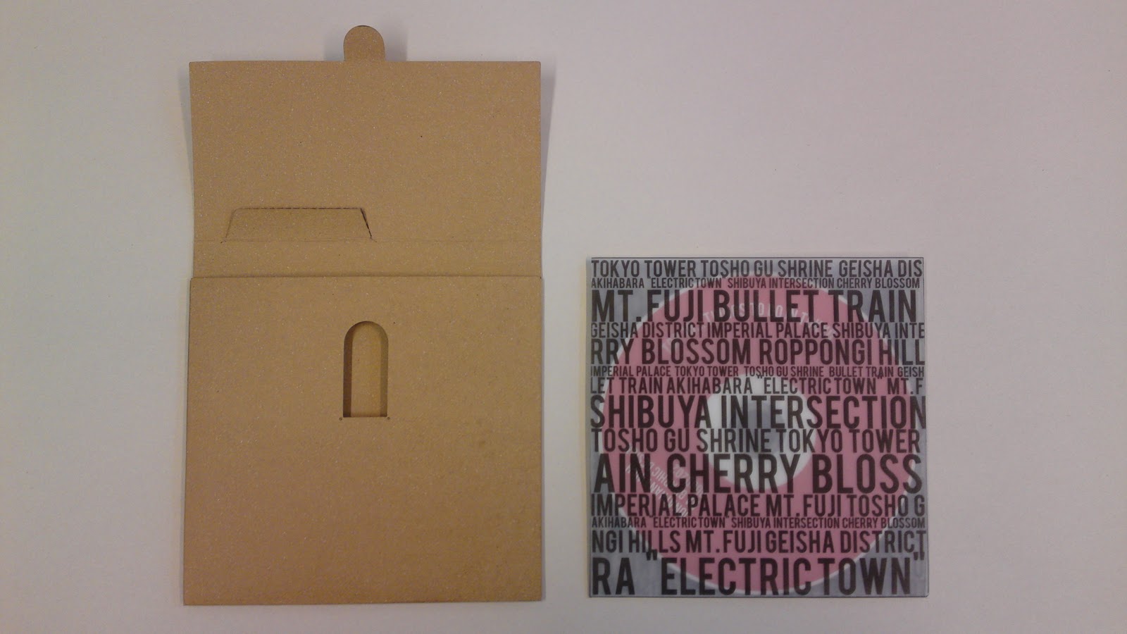
The inner sleeve was printed on tracing paper to allow the disc, that is yet to be printed, to show through. Im really pleased with how this has turned out as I think it helps to personalise the card disc holder more whilst the design retains a simple but effective colour scheme and the red circle on the front should give and instant indication to someone that the content of the DVD is about Japan and Tokyo.


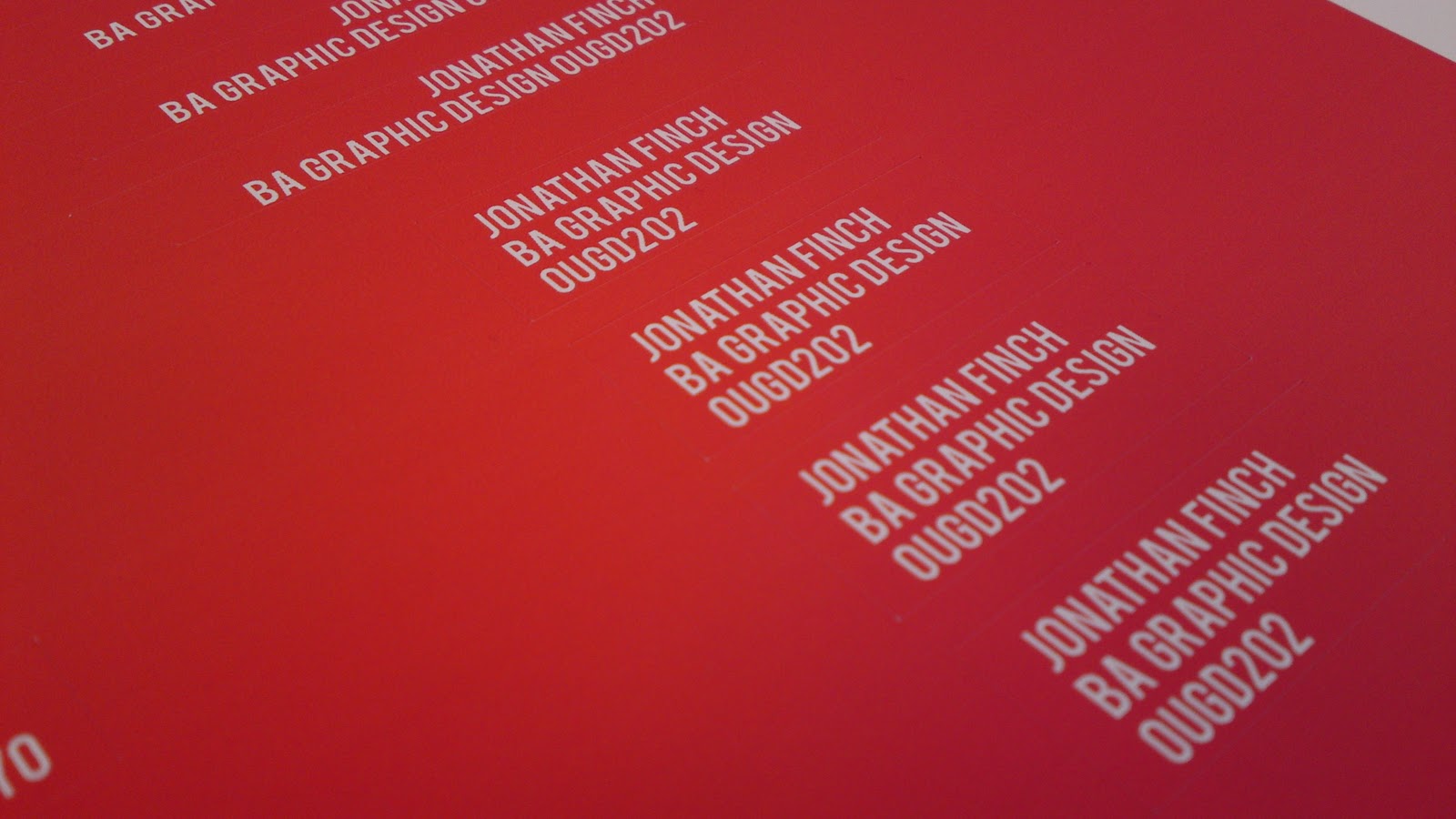
Red and white stickers printed and applied to the brown card DVD case. Colours match those used in the actual animation and I think they produce a very effective but simple design.

Friday, 11 February 2011

Top 10... Ident 4


The final ident features the end part of the main title sequence with the text and logo fading in co-ordinated with the signal pulses from the Tokyo Tower.


Top 10... Ident 3


The third ident features Mt. Fuji and the bullet train which brings in text in a different way to the other idents which help to make the short sequences a little more diverse.


Top 10... Ident 2


The second ident uses the rising sun section of the title sequence and the audio had to be faded in and out as in was cut from the middle section of the animation.