Saturday 30 October 2010

What Is Good? : Final Idea

'LOST CITY IN A BOX'

I am going to concentrate on one of the lost cities and produce a package/parcel with several different elements that will communicate or give the experience of the destination to the audience.

The package would comprise of a box which would contain things such as a 'pop up city', map, postcards, travel information, conservation information, donation card.

A lost city in a box - Purchasing the product would be a donation to conservation efforts of that city and its surrounding environment, heritage and wildlife etc.

Friday 22 October 2010

Wrap It Up - Final Resolutions

Below are the finished resolutions from the 'Wrap It Up' brief. I used photographs as the main imagery as this is what initially drew me to my subject matter of the Maya Civilisation and subsequently lost cities. I didn't want to apply the text to the packaging in a generic way, I wanted it to be relevant to the subject and I came up with the idea of creating a passport stamp style design that communicated my word of 'discovery' effectively and sympathetically.

Printed on watercolour paper through inkjet printer.
Two colours used : Dark blue and red.
Duotone image.


Formative feedback :

Best use of type & image - 16 votes
Best use of packaging nets - 3 votes
Best print considerations - 11 votes

Comments :

- Love the visual style, use of colours and stock is effective.
- Interesting use of stock and image.
- Nets relate to the message and concept appropriately.
- The colours and style work well.
- Good colour consideration and choice of stock works well with the colour and imagery.
- The use of colour and stock work really well together, carefully crafted.
- Revealing image through the packaging > discovery, surprise.
- Nice stock and colour use.
- Good stock choice and textured effect on stamp design. Duotone works well on the imagery.
- Really like the style of the duotone image.
- Stock works well with the image style and colour, nice!
- Replicable for mass production, great stock, use of colour, love it!
- Really like the substrate and images. The work well as a range.

Thursday 21 October 2010

What is Good? - Concept Crit


Feedback received :


Problem Analysis -
(Identification and evaluation of key issues relating to the brief including creative opportunities, target audiences and appropriate contexts)

Lost cities promotional guides.
Experience guides/tours.
Lost cities and civilisations of the world.
Lost cities and their architecture.
Need to be more specific about what you're promoting.
Gap year students? Adventure travellers?


Contextual Understanding -
(Awareness of the creative and professional context for the work produced, informed by the critical analysis a range of appropriate contemporary creative practices and methods of distribution)

Need to produce more than just a guide; various stamp designs, passport book, mail shots.
What would be appropriate for the subject matter?
Prioritise the top ten places for example that people should visit and you should promote.
Treasure hunt/element of collecting or following a trail.


Research -
(Evidence of the ability to gather material from a breadth of sources using a range of diverse and inventive primary and secondary research methods appropriate to the brief)

Ask students what they want from a gap year.
Archaeology placement scheme for students.
Hidden facts and information to integrate?


Additional Comments:

Very interesting subject/concept, make sure you make it unique and unlike generic travel guides etc.


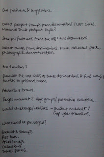
Personal notes taken from Crit feedback :

Type Workshop 4


Five or six columns is best as it becomes more flexible. There are more lines to use as guides and line text and images up with. Stretching images to bleed. Not all text has to be in the same column layout... some could be across the page whilst some is split into three columns for example.


Get the text into a font, size and weight with appropriate leading that is readable first before using the remaining space in which to place the image.


Remember tools that can be used to make/gain space; line space, indent, font, weight, leading etc

Tuesday 19 October 2010

InDesign Workshop 2

FILE > Adobe PDF Presets
(Quality PDF if sending to printers, small scale for just viewing on screen)

Once a PDF has been sent to the printers, they can view it with all colour separations etc through Adobe Acrobat.


FILE > PACKAGE
(saves everything in a file ready to send to print)

- Use links tab to ge information on the images within the document. To prevent going back to correct any images, make sure they are scaled in Photoshop before placing into InDesign. The small pencil icon on the links palette lets you edit the original image in Photoshop if you have it saved.

- Image is only 72dpi instead of 300dpi.

- Missing link to one of the images is flagged.

- Two unused Pantone spot colours haven't been deleted.

- Front cover design isn't stretched to bleed.

- 'Back Cover' text is in registration black.

- The blue background colour is an RGB colour.

For this second InDesign workshop we were given the task of finding the 8 intentional faults with this document. The ones we found are as follows:

- 2 Pantone spot colours on the separations palette are not used.
- The image on the first page isn't stretched to bleed.
- A link to one of the images in the document is missing.
- One of the images is only 72dpi and it should be 300dpi.
- Text on the back cover is in registration black.
- Blue background colour is an RGB colour.
- One of the images is in RGB mode.
- One of the images has been scaled up and become pixelated.

Sunday 17 October 2010

Stamp Idea


Wrap It Up - Development


So far I have been finding it difficult to communicate my subject of lost cities through the given nets that we have to choose from. Packaging isn't something Im used to working with all that much and so I have found it tough to come up with ideas from looking at the basic nets. So instead Im going to try flipping it the other way around and try to design the graphics first and then apply them to a piece of packaging.
From just looking at the nets themselves I thought about using the way in which the pieces of packaging work in order to communicate my word 'discover'. For example, the envelope with the cut out window could have a tag line, 'A window into another world', and the carton/box could have one saying 'Open up another world'...its not much..but its a start.

Thursday 14 October 2010

Type Workshop 3

According to how much space you have at your disposal or how you want your type to be read, a combination of factors such as; line spacing, indenting, leading and point size are the tools that can be used to help achieve what you want.


In order to create a consistent paragraph indent when working in InDesign :
TYPE > PARAGRAPH > Use Arrows To Create Indent

The average setting for 12pt type is for it normally to be set on 14pt leading. Never anything less, no negative leading. This formula can then be used to calculate the leading for other point sizes, so, if 12pt type is set on 14pt leading then 24pt type should be set on 28pt leading as you have to double it.
Increasing leading makes it easier to read. Could reduce point size and increase leading.
The second column is easiest to read. Georgia Italic 9pt type on 15pt leading.

List the ten things you read first when first looking at this poster :

1. Les Kellett
2. Klondike Jake
3.Wrestling
4. Victoria Hall, Hanley
5. Bobby Ryan
6. Colin Bennett
7. Sid Cooper
8. Alan Dennison
9. Harry Palin
10. Sid Cooper


Gill Sans Italic 30pt and 45pt.
Continuation from previous type workshop. Playing with the proverb to communicate its meaning.

Wednesday 13 October 2010

What is Good? - Rationale

GOOD is ... Lost Cities Of Ancient Civilisations

Why?

1. Amazing architectural ruins.
2. Extraordinary settings of where these former cities are located.
3. Symbols of great civilisations.
4. Opportunity for more adventurous travel.
5. Magical/mythical atmosphere and surroundings.


I intend to... inform and promote...

... a group of... adventure travellers or gap year students...

... to visit these lost cities in different locations around the world.


In order to achieve this I will produce...

Some form of guide/set of guides to promote the lost cities as destinations to visit along with factual information about each of them. Perhaps a boxed set for different civilisations or regions. Maybe something in which you could store relics/souvenirs from the locations.


This will be produced using...

Probably Litho and/or Digital printing. Possible use of a special effect such as a varnish, foil blocking or embossing/de-bossing.

Wrap It Up

The Brief:

Sum up what your 'Good' is from your current 'What Is Good' project in a single word and a single image. You have to choose five out of fifteen given nets to investigate and then select three of these five to take further and produce packaging solutions to what you need to communicate.


Target Audience:

Adventure travellers and gap year students.


Tone Of Voice:

Informative but exciting tone of voice to attract the attention of travellers whilst inspiring them to visit the places that are being promoted by the packaging solutions.


Considerations:

Media/Content/Colour/Font/Format/Form. Think about the interior and exterior. One word is what you are trying to communicate. The three pieces of packaging could become a set of be very different.


Mandatory Requirements:

Two colours + stock. Cant modify the nets, only make them bigger or smaller.


Deliverables:

Three packaging solutions.

Tuesday 12 October 2010

InDesign Workshop

Placing images from other programmes into InDesign -

Photoshop | Illustrator :

CMYK/Grayscale | CMYK
Actual Size | Illustrator Infinite Size
300dpi | Copy & Paste into InDesign
Tiff/PSD | Ai

Any images used in your design once copied into InDesign must be 'packaged'. Its best to make a folder containing your design as well as all the separate images saved independently in it.

Select all unused colours and delete them from your swatches when your design is finished. Use drop down menu (top right) and select - 'remove unused swatches'.

Overprinting - When two colours are overlaid and merge.
Knocking Out - When the colour on top knocks our/eats into the background colour.
*Black always overprints.
WINDOW > OUTPUT > ATTRIBUTES
Check the box 'overprint fill to print on top'

VIEW > OVERPRINT PREVIEW
Shows what will be printed.

Trapping - Adding stroke to text for example that is the same colour as the background. Helps to prevent misregistration. Good for producing screen printing negatives.
WINDOW > OUTPUT > ATTRIBUTES > OVERPRINT STROKE


Using separations to print individual pages of separate colour. e.g Cyan layer.
WINDOW > OUTPUT > SEPARATIONS


Spot Colour:
(on swatch palette) > top right drop down menu > new colour swatch

Placing a duotone image will instantly add the spot colours to the swatch palette.


The text frame tool is similar to the rectangular frame tool but is used to frame text instead of images.

Rectangular frame tool which can be used on which to import/place images into the InDesign document. It has been filled with a colour and a heavy stroke added to it.

InDesign page with standard bleed of 3mm. 3 columns have also been set up.