Friday 30 September 2011

Imagine_That: Final Resolution and Submission

Final design for the A5 format magazine cover.


Front Cover.

Back Cover.

Here's the short description I wrote to send in the submission email:

My submission is based around the idea the one event/one thing starts a reaction or something that grows and evolves. I have tried to communicate that issue one of Imagine That magazine is one such event that will progress into something that will continually develop becoming bigger and better with each edition which is symbolised through the expanding rings. This relates directly to what I perceive as the concept of Imagine That as it helps students and recent graduates to progress and develop within their specialism.

Proof of email submission:


Confirmation reply email:


Imagine_That: Magazine Cover Development

For the cover of a launch issue of a magazine I felt the design had to be simple and striking. It has to be noticeable and show that it's arrived. It also had to reflect the simplicity of the concept which was 'one'.

The simplest element that I could think of to work with was a circle.


I've developed a simple black a white pattern using simple circles that build in weight and expand outwards from the 'i' of Imagine That. In doing this I was trying to show that one event/ one thing starts a chain of events or something that grows and develops. I was also trying to communicate the aspect of imagination which obviously links to the title of the magazine.


The Imagine That blog seems to have a strong following but with this being their first publication I'm unsure as to what kind of budget they would be running with. Therefore the simplicity of just using black and white would help keep costs down but it could easily be made more luxurious if needed by adding a spot UV layer of varnish to the black circles and logo for example.

Personal Business Cards

I've finally gotten around to finishing my first business cards! 

I did go for the custom stamp in the end and I think it works well, especially on the grey-board stock. It also means I can just make them as I need them and the stock is really cheap to buy. Then by the time the final show comes around I can get some professionally printed perhaps. Also, now I have the custom stamps made, I can use them on other things where I could use my logo or details.


Thursday 29 September 2011

Revised Briefs

Below revised versions of 3 of my 4 core briefs. The other will be a live project based on a brief from either YCN, D&AD or ISTD once they have been released.

Tagging for the briefs during this module will be as follows:

CORE BRIEF 1 - COLOUR EXHIBITION
CORE BRIEF 2 - PANCAKE HOUSE
CORE BRIEF 3 - COLLABORATION BRANDING
CORE BRIEF 4 - ISTD

EXTRA BRIEF 1 - MANCHESTER BOOK FAIR
EXTRA BRIEF 2 - IMAGINE THAT


Here is one of my additional briefs which is tailored to a submission for the upcoming Manchester Book Fair.

Tuesday 27 September 2011

Imagine_That: Live Brief

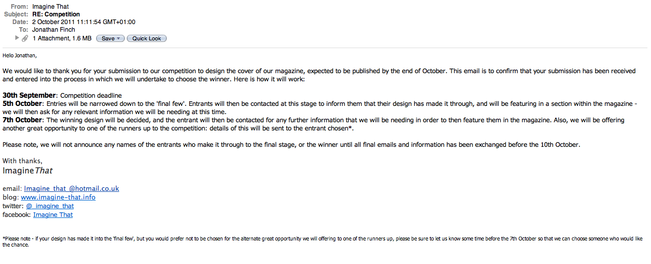
So one of the briefs I collected over summer was a live brief from the online blog Imagine That. It's going to be one of my additional briefs that runs alongside the 4 main 'core briefs' but the deadline for it is Midnight on Friday 30th September so I need to get a move on with it!


Above is how I had re-written the brief for the collection of 10 briefs over summer. Below is the brief in full taken from the Imagine That blog.

Competition Time!

The Brief
ImagineThat is a collaborative collective, set up to promote, educate and inspire creative students and recent graduates about contemporary design and creative arts.

Things are evolving here at ImagineThat, and we are developing more ways in which you could get involved with us. Our next idea is to produce a magazine in which we want you to design the cover for.

Concept
The theme we are going for with the magazine, with this being our first issue, is that we have a running concept of 'ONE'. (The name of the magazine will be Imagine That). What you do, and where you take it is completely up to you. We want creative concepts and designs to inspire the readers of ImagineThat, so the more creative the better.

Deliverables
The design itself is to be of a portrait A format, preferably A5, although can be scaled down if designed bigger.

Any design discipline submission is welcomed (photography/illustration/typography/etc), the more variety the better.

How To Enter
All submissions must be emailed to us in a JPEG format. Once the winner is chosen they will then be contacted to send us a higher resolution copy.

When submitting, email entries to us at imagine_that_@hotmail.co.uk, with the subject asCOMPETITION - that way no entries will get lost. Include your full name, course and university you study/studied at, and a brief description for the entry.

Deadline
All entries must be sent to us by midnight on 30th September 2011.

Once the deadline has passed, our team at ImagineThat will then decide which entry we will then go on to be used as our magazine cover, and the winner will then be contacted.

The Prize
The winner will have their entry used on the cover of our first issue of our upcoming magazine. They will also be featured in the magazine, and receive a free copy of it along with a free screen print.

We will also be giving a selected few runners up the prize of having their entry featured on our blog/in the magazine.

If you have and questions or anything about the competition, please don't hesitate to get in touch. We will be more than happy to help. Simply send us an email with the subject as Competition Question, or get in touch with us through our Facebook page or Twitter account.

ImagineThat
imagine_that_@hotmail.co.uk

DandAD Final Poster


I've amended my design after the pin up and crit session earlier and I'm much happier with it now. I think the black background really helps to set off the design as it helps make the candles look more like what they are supposed to be whilst it gives the overall poster much more impact.

Now to submit it to the competition!

DandAD Poster and Pin Up


Above is my design for the poster. I was quite pleased with it on screen but after printing it and viewing it next to some of the other designs I think the white background hasn't complemented the simplicity of the design. The following feedback from the crit confirmed this...

Crit Feedback:
- Try yellow or black backgrounds and change the other colours accordingly.
- The 'D&AD North Lecture' sentence could be a few point sizes smaller.
- Simple vector illustration works well.
- The design communicates the subject of the lecture effectively.
- The text at the bottom could be smaller.
- Change the typeface to Helvetica as this is normally used by D&AD.

I'm going to have a play around with my application of colour before submitting. In response to the feedback I got I think the background colour was the main issue and not the actual imagery used.

Monday 26 September 2011

Rationale and Brief Proposals


Dissertation Title:
Discuss the London Olympic Games 2012 brand as a piece of graphic design entering the mainstream public consciousness.

Dissertation Tutor:
Lorraine Mcckee

-------------------------------------------------------------------------------------

Rationale:
A print driven investigation into identity and brand with a focus on process and finish.

This year I'm aiming to focus my practice around developing visual identities and brands which are applied through carefully crafted and effective print based resolutions. This will build on successful elements from last year which included publications, posters and promotional work whilst giving me the opportunity to make my work more commercial and professional.

Statement of Intent:
When approaching my statement of intent for my final year I felt it was essential for me to take a period of time to step back and reflect on my own work to help inform and remind me of what I’ve already done and what I want to do more of. Up until recently I knew that I definitely prefer designing for print, but after that I was unable to be anymore specific. I have also taken the time to focus on researching into designers and studios I admire and then pin-point exactly what it was within their portfolios that really interested me.
Through doing this I have realised that visual identity and branding are aspects of graphic design that particularly engage me and yet are practices I haven’t really covered much so far. I see this area as addressing both the look and feel of something with the chance to apply visuals across a wide range of variable media, covering all access points to a brand between customer and client.
Then, from reviewing my own body of work from the last two years I can also say that I enjoy editorial and promotional based briefs after producing a few successful publications for a variety of projects and pieces of poster art which I’d like to expand on. I also think that just because I’m entering my final year, it doesn’t mean I can’t keep having fun and experimenting. Last year I really enjoyed developing a typeface for a placement competition and I would like to do more of it whilst I think it could fit well with my planned identity and brand work with regards to producing custom lettering and logotypes.
Taking all of this into consideration, the briefs I have chosen to source and write should cover these areas of interest and allow me to start building a portfolio that represents what I can do and what I enjoy. Through my ongoing research into contextual references I have taken briefs from projects I liked and then re-written them with a whole new subject to base it on. I intended to strike a good balance so other briefs are live competitions or based on successful aspects from last year whilst I have also organised collaboration with a fellow student. I also expect further live briefs to come up throughout the year which can be for competitions or to gain placements and I certainly intend to react to these.
In terms of the briefs themselves, I’ve tried to include subjects/themes relevant to the kind of small and medium size companies that I’d like to produce work for. Obviously designing for creative industries often allows much more freedom and so is highly competitive but I also intend to aim at independent and ‘boutique’ businesses which tend to look for creative identities and quality printed media.
This should help me to develop a more commercial edge and ultimately a more professional execution to my practice and produce a body of work that suggests carefully considered, crafted and effective print-based design.

Brief 1: Colour Exhibition

Brief 2: Mens Fashion Store

Brief 3: Restaurant Branding (collaboration with Naomi Farrar)

Brief 4: Live Brief TBD
Respond to one of the live 2011/2012 briefs released by either D&AD, ISTD or YCN.

Additional Briefs:
- ImagineThat. (live Brief) Magazine cover design.
- Manchester Book Fair 2011. Create a typographic magazine and promotional poster.


Sunday 25 September 2011

DandAD Poster: Ideas

Initial ideas for the D&AD poster brief. My preferred idea so far is to use candles in my design to signify the birthday of agency GBH. Im probably going to stick with the black, yellow and white colour scheme used in the D&AD brand.


Friday 16 September 2011

Personal Business Cards

I've designed some personal business cards that match in with the identity used for my website and blogs. I've tried to keep it simple and clean with the finished thing probably just printed black on a grey-board type stock. I'm also thinking of getting custom stamps made to produce them which should add a different sort of finish and with using this method and sourcing a specific stock, it should start to communicate aspects of my working practices.


Tuesday 13 September 2011

3rd Year Statement of Intent

Before nailing down the outline of my creative focus for my final year I felt it was essential for me to take a period of time to step back and reflect on my own work to help inform and remind me of what I’ve already done and what I want to do more of. Up until recently I knew that I definitely prefer designing for print, but after that I was unable to be anymore specific. I have also taken the time to focus on researching into designers and studios I admire and then pin-point exactly what it was within their portfolios that really interested me.
Through doing this I have realised that visual identity and branding are aspects of graphic design that particularly engage me and yet are practices I haven’t really covered much so far. I see this area as addressing both the look and feel of something with the chance to apply visuals across a wide range of variable media, covering all access points to a brand between customer and client.
Then, from reviewing my own body of work from the last two years I can also say that I enjoy editorial and promotional based briefs after producing a few successful publications for a variety of projects and pieces of poster art which I’d like to expand on. I also think that just because I’m entering my final year, it doesn’t I can’t stop having fun and experimenting. Last year I really enjoyed developing a typeface for a placement competition and I would like to do more of it whilst I think it could fit well with my planned identity and brand work with regards to producing custom lettering and logotypes.
Taking all of this into consideration, the briefs I have chosen to source and write should cover these areas of interest and allow me to start building a portfolio that represents what I can do and what I enjoy. Through my ongoing research into contextual references I have taken briefs from projects I liked and then re-written them with a whole new subject to base it on. I intended to strike a good balance so other briefs are live competitions or based on successful aspects from last year whilst I have also organised collaboration with a fellow student. I also expect further live briefs to come up throughout the year which can be for competitions or to gain placements and I certainly intend to react to these.
In terms of the briefs themselves, I’ve tried to include subjects/themes relevant to the kind of small and medium size companies that I’d like to produce work for. Obviously designing for creative industries often allows much more freedom and so is highly competitive but I also intend to aim at independent and
‘boutique’ businesses which tend to look for creative identities and quality printed media.
This should help me to develop a more commercial edge and ultimately a more professional execution to my practice and produce a body of work that suggests carefully considered, crafted and effective print-based design.

Brief #10