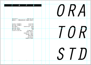
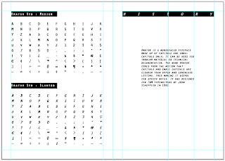
Started on some initial designs for the Orator newspaper. Since it's not one of my core briefs and the deadline is approaching quickly in order to be ready for the book fair - I've been moving quite fast with it. Useful things I learnt from making the Futura Newspaper such as the newsprint stock to make it really economical is something I already wanted to carry over into this project and I feel this series will make a great side project that I can keep returning to every so often.
From my initial research into the Orator font I've learnt a little about it's history although I haven't been able to find a great deal written about it. Basically, it was developed as a typewriter font in the 60's - and this mechanical, technical feel was something I wanted to be prominent in the design work and it would also help to keep a consistent feel throughout. Not sure if I'm going to keep it all black and white yet although this might make a good change.


No comments:
Post a Comment