
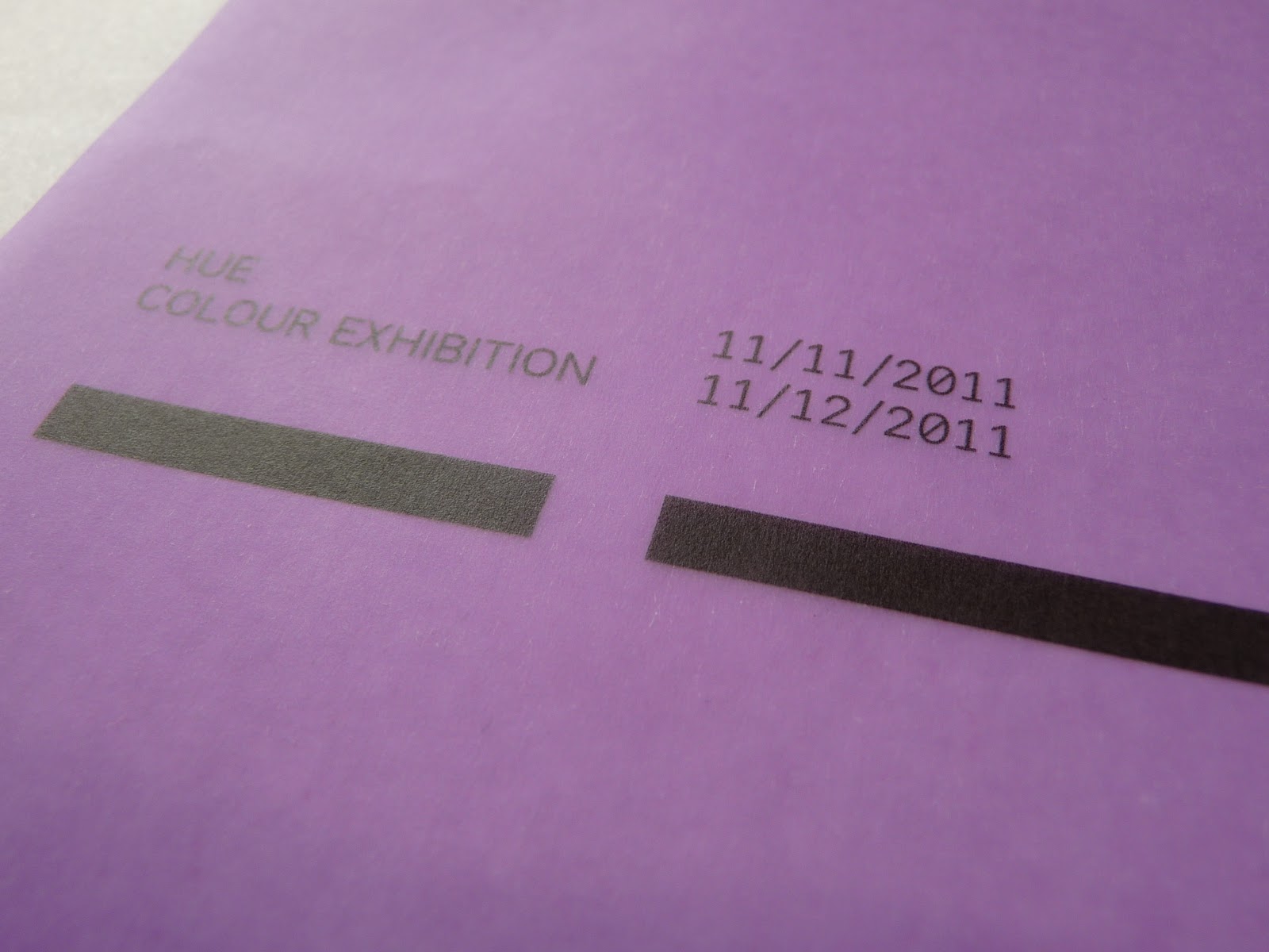
Developed a simple design for the cover of the guide book based on the branding I've developed so far posters. Since I only have limited number of paper samples, I have had to test the design on colours that I don't actually want to use! When it comes to printing the final ones I plan to use the 3 sets of 3 colours I chose for the posters to create some consistency which would give me a total of 9 different guidebook covers.
The Kiwi and Purple stocks have worked fine for the test prints and Im happy with how they look but the Deep Ocean stock was more waxy which has led to the ink running a little. As I said though, these aren't the colours I'll be using and most of them should be ok. But if a couple do end up with the ink running then I'll just be careful in terms of how I present and photograph them. They should certainly be ok to photograph en masse in a full range of colours.
Also printing just black ink shows some consideration that if this was a live brief, then extra money that had been spent on multiple colour stock could be balanced out a little by minimal printing in only black ink.


No comments:
Post a Comment