Showing posts with label OUGD101. Show all posts

Friday, 20 November 2009

Brief: No News Is Good News: Message and Delivery


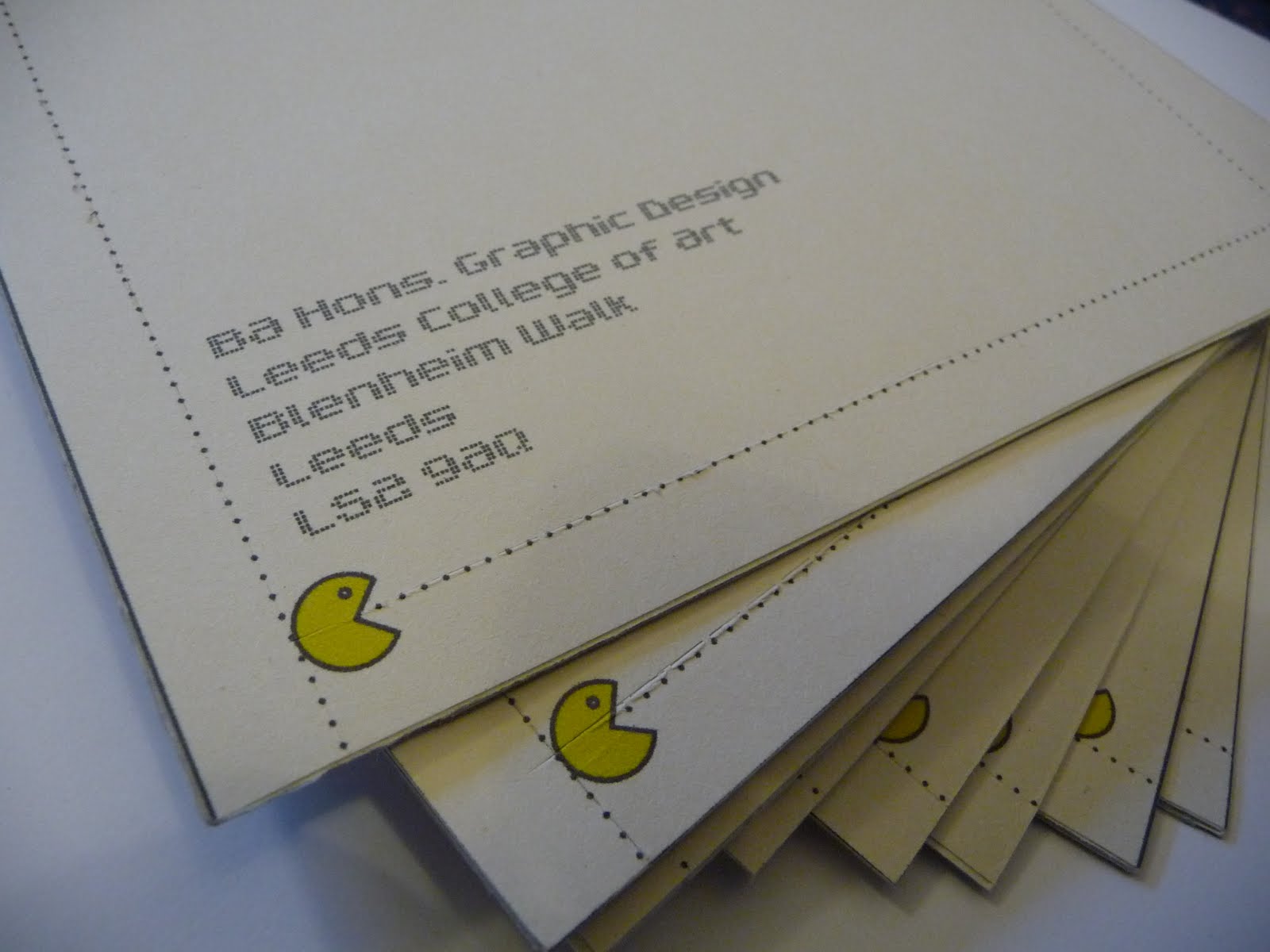
Upon designing the mailshot I felt that it needed to be interesting to open whilst retaining its pleasing visual simplicity. I then came up with the idea of using perforated edges on the envelope which I thought would make the recipient more intrigued to open it but more importantly i felt it was a good way of including a subtle message about wasteage. The action of tearing paper and throwing it away links directly to the subject of the mail and posters which is all about human consumption.
Once opened the mail would be lined with the pac man designs used in my posters and hold inside some informative postcards with various statements and accompanying visual imagery. In terms of the mailing list, the piece was to be sent to companies that deal with large volumes of food such as the major UK supermarkets as well as our own forest protection agencies and environmental charities.
The overall design was kept consistent with that of the posters whilst adding extra little details to develop the piece further.
Im really pleased in particular with the envelope as the deign is clean and contemporary whilst being intriguing to open.

Tuesday, 10 November 2009

Brief: No News Is Good News: Message and Interpretation


For the 'no news is good news' brief we were asked to create a series of 3 high impact posters based around a newspaper headline we had chosen. One poster was to be purely text, another purely image and the other both text and image. My headline was about human consumption (particularly food production) and its effects on the planets resources. We were encouraged to use simple shapes and symbols in order to communicate our message quickly and effectively and i have used a 'pac man' theme to show the destruction of rainforests. Each poster had to measure 21cm by 42cm and other constraints included a maximum of two colours plus stock.

Thursday, 22 October 2009

Alphabet Soup- part two: Resolution


Above is the A1 Sheet on tracing paper and name badge that were completed for the alphabet soup part two. After finishing we had to present our typeface to the person it was based upon and also to a small group of tutors and students.

On reflection of my typeface there are aspects of it that i really like such as the line quality and stylised approach applied to the letters but i also dislike how it can't as yet be used as an actual typeface because of how each letterform joins together.
I will continue to refine the letterforms in my spare time in order to fully resolve the brief whilst i also want to experiment by using colour within the typeface.

Wednesday, 14 October 2009

Alphabet Soup- part two: Development


For the second part of the Alphabet Soup brief our group members were put into pairs and given a series of questions to interview each other with. We were then asked to produce a font including glyphs that represented that person.
Rather than trying to answer all of the questions at once I selected one response on which to base my font which came from the question, 'What is your most treasured possession?'
With the answer being her jewelry I set about designing a decorative font that communicated four particular words that related to the jewelry which were: Playful, Decorative, Sentimental & Contemporary.
We were also asked to seek out an existing font on which to base our own work and I chose RNS Camelia - a modern serif font with smooth curves I felt would lend themselves well to the jewelry theme. I have since begun developing and decorating the font as pictured above and I'm now in the process of refining the letterforms and designing the glyphs in preparation for the final resolution : An A1 sheet with all 26 letters of the alphabet along with 6 glyphs.

Thursday, 8 October 2009

Alphabet Soup- part one


For the alphabet soup brief we were asked to create ten letterforms that communicated a given word, mine being 'Extend'. I started by experimenting with shadows as they provide a natural form of extension and through using stencils and a desk lamp i managed to successfully distort and stretch each letterform. Simple blending options and slight adjustments were applied to each letter on Photoshop but i didn't want to make any major changes so as not to distract the viewer from the original image. I found that the technique worked best when extending two or more letterforms into each other but the brief stated that for the final resolution each letterform must be presented individually.

Friday, 2 October 2009

Brief: How to...


Our brief was based around solving a problem encountered when living away from home for the first time. The given problem for our group was:


How to... Live with people you don't like.


We set about our task by initially researching into student experiences of previous flat mates in order to gain an insight into what issues have caused tensions to arise. Though doing this we quickly discovered that when it comes to actually living with people you don’t like on a day-to-day basis, it is extremely difficult to fully resolve the situation. This led us to believe that sometimes it is more about making the best of your circumstances and so we set about an idea that could just make somebody’s life a little more bearable- even when living with the flatmates from hell.


Our idea was essentially based around a simple slogan:

MAKE TEA NOT WAR!

…and it comes in the form of a simple tea making kit consisting of two mugs and two tea bags inside a carry case.
We thought that the idea of having a cup of tea and a chat is such an instantly recognisable method of either getting to know someone for the first time, or on the other hand it can be a type of social tool that can be used to help resolve differences once they have arisen.

Going back to our initial thoughts and ideas many people said, however stereotypical, one of the first things they did after moving in was to have a cup of tea! The light hearted approach would ideally help people warm to each other and ultimately have fun and enjoy themselves which is what living with new people and starting university is all about.

Tuesday, 29 September 2009

Summer Brief: Research


Over the summer we were told to collect as many different letter styles as possible. Then in small groups we combined our research and were then asked to categorize the letters in any way we wanted and our group decided on scale and gradient. Going from small at the left and large to the right as well as light at the top to dark at the bottom.

Saturday, 26 September 2009

Summer Brief: Alphabet


The summer brief project involved designing a typeface that reflected who we are. I tried to keep the theme uncomplicated and to the point whilst attempting to convey key aspects of what i admire in terms of design.
The predominant words i would use to descirbe this typeface are; simple, precise, contemporay and methodical.
I wanted to ensure the letters worked as a sequence and so i built up a sort of formula that would give an aestheticly pleasing consistency and smooth flow between each individual character.
I chose to use plain cartridge paper and just a scapal and ruler to craft each letterform so as not to distract from the typeface itself leading the viewer to be more inclined to focus on the actual style of the lettering.